VR7 Landing Page:
Optimizing User Experience
for Conversions
VR7 Landing Page:
Optimizing User Experience
for Conversions
This project involved conducting a design audit and proposing improvements for the VR7 product landing page of Vorwerk. The primary focus was on enhancing usability and achieving business goals.

"A winning landing page isn't just about aesthetics; it's about understanding user needs and guiding them towards a seamless experience. By prioritizing clarity, simplifying navigation, and building trust, we can transform landing pages into powerful tools for conversion and brand advocacy."
Talayeh Dehghani

Vorwerk Company, based in Switzerland, is the client for this project. They are seeking to improve the usability and effectiveness of their VR7 Product Landing page to better engage users and align with their brand identity.
The existing VR7 landing page suffered from usability issues that hindered user experience and conversion rates.
Services
Usability Testing
content Audit
Conversion Rate Optimization
Wireframing
The outcome of this user-centered design approach is a set of data-driven solutions tailored to address the specific needs and pain points of Endress+Hauser's B2B customers.

The visual audit focused on evaluating the visual design elements of the VR7 Product Landing page to ensure consistency, clarity, and alignment with the brand's visual identity. I assessed aspects such as color scheme, typography, imagery, layout, and branding elements. Through comparative analysis and design principles, I identified areas where visual hierarchy could be improved, elements could be made more visually appealing, and the overall aesthetic could better reflect the brand's image.
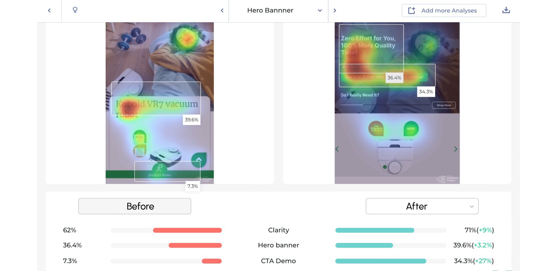
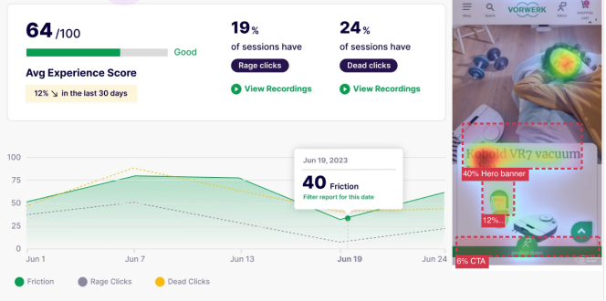
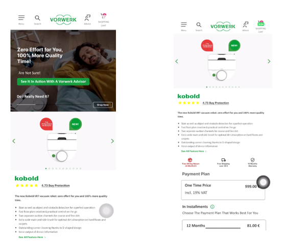
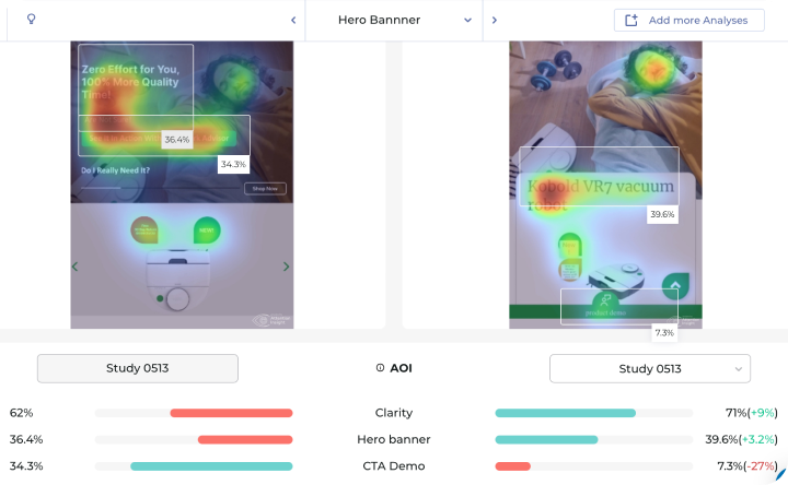
The hero banner lacks a clear visual hierarchy, making it difficult for users to quickly grasp important information. The hero banner is static and lacks interactive elements, resulting in low user engagement and a less immersive experience
There is a lack of a compelling call-to-action (CTA) in the hero banner, which could increase click-through rates. The hero banner does not effectively align with the brand's voice, resulting in a disconnect between the message and brand identity.


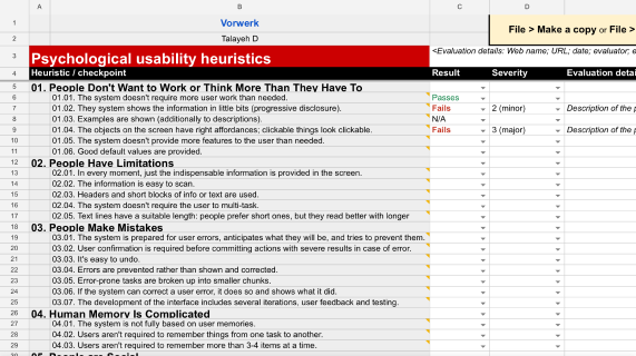
The UX audit focused specifically on evaluating the usability of the landing page and demo page for the VR7 Product. This involved assessing the overall user experience, navigation flow, interaction design, and usability of key features unique to these pages. I conducted heuristic evaluations, user testing sessions, and analyzed user feedback to gain insights into user pain points and challenges encountered during their interactions with the landing and demo pages.


The functionality audit aimed to evaluate the performance and effectiveness of interactive features, forms, and functionalities unique to the landing and demo pages for the VR7 Product. I examined the responsiveness of interactive elements, the efficiency of form submissions for scheduling demos, and the functionality of key features such as CTAs and navigation menus. By testing various scenarios and user interactions specific to these pages, I identified areas where functionalities were lacking, buggy, or confusing and proposed solutions to enhance usability and user experience.

The content audit involved analyzing the quality, relevance, and clarity of content displayed on the VR7 Product Landing page. This included assessing the readability of text, the effectiveness of messaging, and the alignment of content with user needs and brand objectives. I reviewed existing content, identified areas for improvement, and proposed strategies for enhancing content clarity, relevance, and engagement. Additionally, I conducted competitor analysis to benchmark content quality and identify opportunities for differentiation.


Redesign the hero banner to include a clear visual hierarchy, emphasizing key information such as product features or benefits.
Introduce interactive elements to the hero banner to enhance user engagement and immersion.
Implement a compelling CTA related to experiencing the demo, using action-oriented language and a standout design to prompt user action.
Redesign the hero banner to include a clear visual hierarchy, emphasizing key information such as product features or benefits.
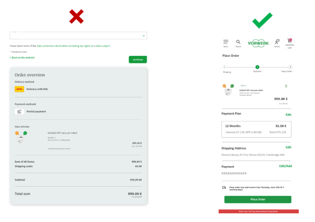
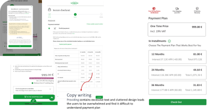
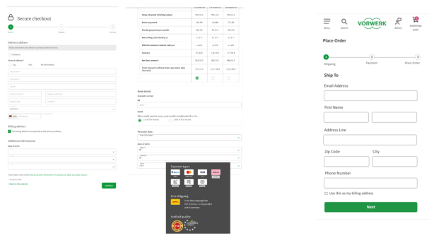
Simplify the checkout process by minimizing text and form fields, ensuring clarity and ease of use. Provide multiple checkout options, including guest checkout and login via Google account, to cater to user preferences. Clearly communicate the benefits of premium checkout to users, using concise language and visual cues to highlight its advantages.

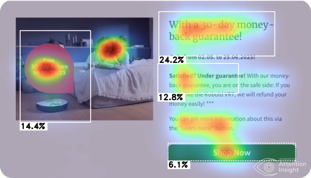
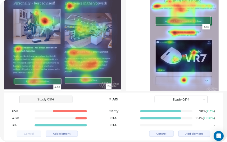
By implementing action-oriented language and urgency-inducing messaging in the call-to-action buttons on the demo scheduling page, we anticipate an increase in user engagement and conversion rates. Users will be prompted to act impulsively, leading to a higher likelihood of scheduling a demo and ultimately driving business growth.