From Chaos to Cohesive: A
UX Case Study in Design
System Creation at Versa
From Chaos to Cohesive: A
UX Case Study in Design
System Creation at Versa
This project details the development of a design system for Versa, a company with a product lacking visual cohesion and consistency. The design system aimed to unify the user experience across different platforms and components built on separate frameworks.

Design Systems are Living Entities.They require continuous maintenance and updates by a dedicated team.
Talayeh Dehghani

Versa is a company with a digital product used by both consumers and clients.
Versa's product lacked a style guide, resulting in inconsistencies in design across various components. Additionally, the product had separate components for consumers and clients, built on different frameworks. This led to a need for a cohesive visual language and a centralized system for managing UI elements.
Services
Design System Development
Accessibility Design
UI Inventory & Audit
The design system wasn't built overnight. Here's a breakdown of the core process followed:

A comprehensive analysis of the existing product identified missing UI components for inclusion in the style guide, ensuring all necessary elements were covered.
A Google Spreadsheet tracked the design, documentation, and code snippets for each component, guaranteeing steady progress.

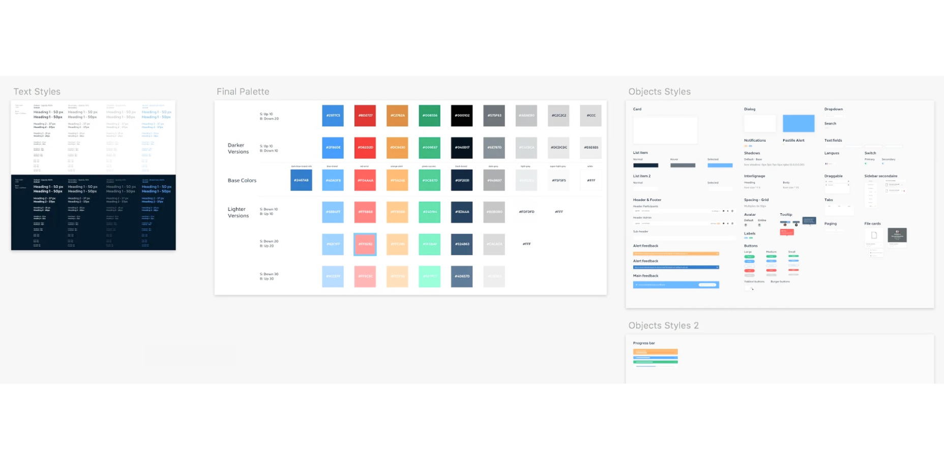
A Figma library was established to organize UI components for easy reference and reuse. We defined naming conventions for clear identification and created multiple variations for different breakpoints and layouts, enhancing design flexibility.

Essential UI elements (atoms, molecules, and some organisms) were converted into Figma symbols and nested symbols for efficient updates and maintenance throughout the product.

Responsive organisms and page templates were built utilizing Figma's Auto-Layout and resizing features. This approach leveraged pre-built components from the library and ensured reusability across various devices and layouts, saving time and effort.

The design system prioritized accessibility in four key areas
Color systems underwent pressure testing to ensure sufficient contrast across buttons, input elements, headers, and themes.


Detailed documentation specified keyboard navigation for each interactive element.
Collaboration with content writers and brand teams ensured the addition of alternative text, captions, and audio descriptions for images and videos.
Clear and valuable interface feedback, including error and warning states, was prioritized. Confusing language was removed to enhance user clarity during interactions.


Beyond user-facing accessibility, we addressed the need for internal accessibility – ensuring all team members could effectively engage with the design system. Our approach included:
Role-Specific Getting Started Guides: The Confluence space offered tailored guides for different roles (designers, developers, content writers). These guides explained how to effectively navigate and contribute to the design system.
Designers: Getting started with Figma libraries and design tokens.
Content Writers: Utilizing the style guide for writing accessible content.


Comprehensive documentation provided guidelines for all aspects of the design system and projects. This included accessibility considerations and Do's and Don'ts for content creators.


The design system successfully achieved:
Visual Cohesion: A unified visual language across the product for both consumers and clients.
Improved Efficiency: Streamlined design and development processes through reusable components and clear documentation.
Enhanced Accessibility: A more accessible user experience across different abilities. Team Alignment: Improved communication and collaboration among design, development, and content teams.