Endress+Hauser Simplifying
B2B Instrument Selection: A
Design Case Study for
Endress+Hauser

Endress+Hauser Simplifying
B2B Instrument Selection: A
Design Case Study for
Endress+Hauser
This case study explores the redesign of Endress+Hauser's online purchasing experience. Endress+Hauser, a leading global supplier of industrial process and laboratory measurement instruments, was experiencing a surge in online B2B purchases but faced challenges with their website hindering this growth

Great UX design isn't just about making things pretty, it's about making them work for real people. I believe in creating experiences that are so seamless and intuitive, users feel like they're getting superpowers
Talayeh Dehghani

Endress+Hauser is a global leader in the field of industrial process and laboratory measurement instrumentation. They offer a wide range of products and services for various industries and were looking to optimize their website to cater to their growing online customer base
The surge in online B2B instrument purchases at Endress+Hauser is hampered by a website that struggles to meet user needs. Customers face difficulty finding the right products due to limited search and filtering, lack clear product information, and a confusing purchase process.
Services
Usability Enhancemen
User Journey Optimization
The outcome of this user-centered design approach is a set of data-driven solutions tailored to address the specific needs and pain points of Endress+Hauser's B2B customers.
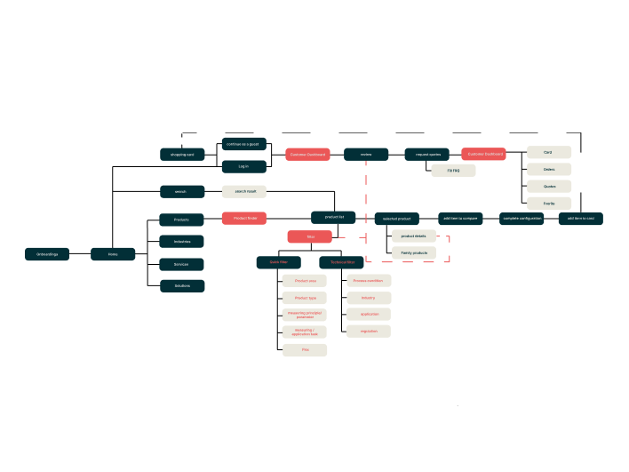
Identifying Navigation Issues: By visualizing the hierarchy of pages and their connections, the sitemap revealed potential navigation challenges. Inconsistencies in page naming or organization could be readily spotted, along with missing sections that might impede user journeys
Uncovering Content Gaps: The sitemap exposed any missing content areas that could hinder user progress towards their goals. For example, a lack of dedicated product filtering pages could frustrate users searching for specific instruments.
Laying the Groundwork for User Research: With a grasp of the existing user flow, the sitemap informed the development of interview questions and usability testing scenarios. By focusing on specific sections in the sitemap, the research could delve deeper into user experiences associated with those areas

Crafting the sitemap involved both manual exploration and, if available, website analytics review. I meticulously navigated the website (endress.com), documenting all the pages and their interconnections. This hands-on approach provided a first-hand understanding of the user experience while traversing the existing information architecture.
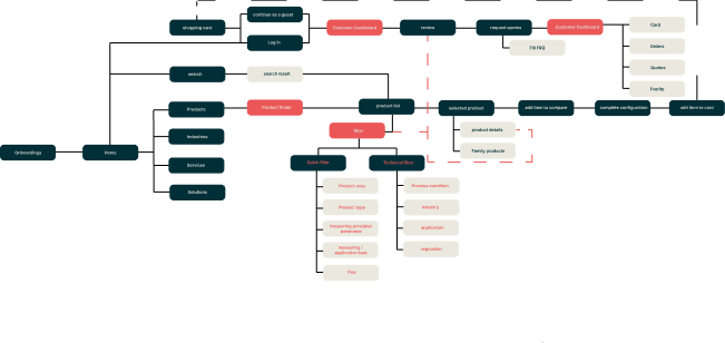
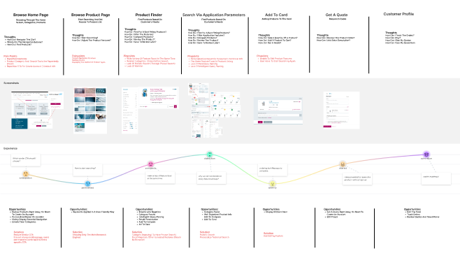
Beyond understanding the website's structure, customer journey mapping provided a crucial layer of user understanding. This technique involved visualizing the steps a B2B customer would take while searching for, selecting, and purchasing instruments on the website.
Mapping Key Touchpoints: The journey map highlighted all the points where a user interacted with the website, including product listings, search functions, product pages, and checkout processes.
An optimization scorecard is a tool used to evaluate the website's effectiveness based on pre-defined criteria related to usability, accessibility, and SEO.
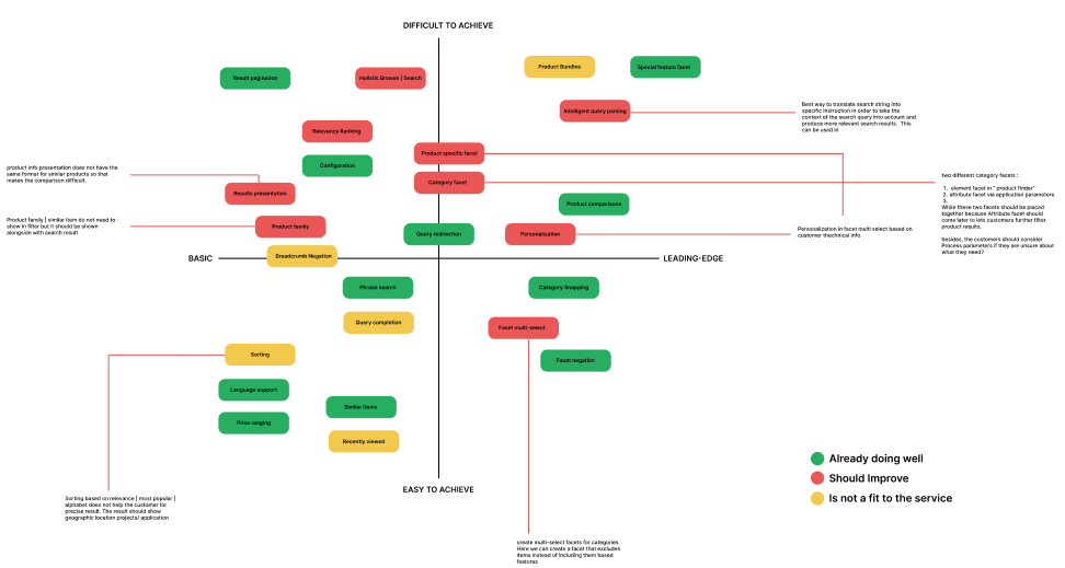
Informed by the research, I prioritized user needs and used brainstorming techniques like Crazy 8s to generate a range of design solutions. These included improvements to search and filtering for easier product discovery, detailed product pages with comprehensive information for informed decisions, a product comparison tool for side-by-side evaluation, a streamlined purchase workflow with clear steps and progress indicators, and finally, a user-friendly interface with consistent design and intuitive navigation for a smooth user experience.
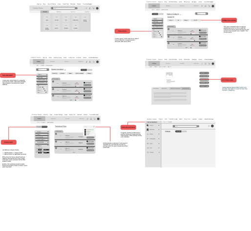
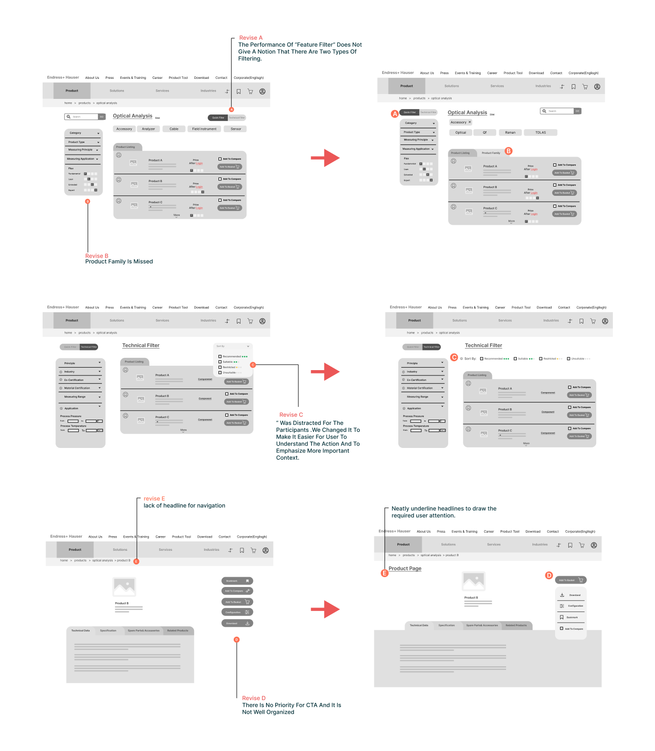
To ensure the proposed solutions addressed user needs effectively, mid-fidelity wireframes were developed and tested through usability testing methods like 5-second testing and guerilla testing. This provided valuable feedback on user interaction and understanding of the proposed design. The feedback received informed the refinement and iteration of the design solutions, ensuring they were user-centered and optimized for a seamless purchasing experience.
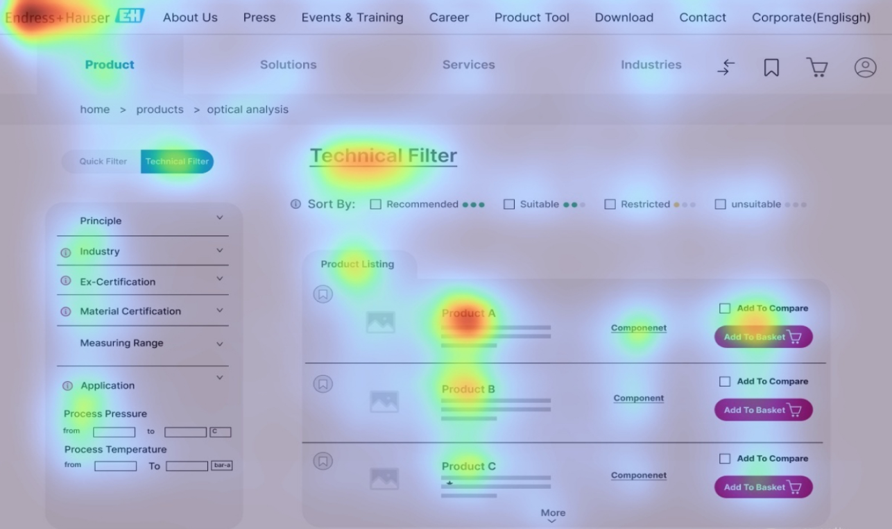
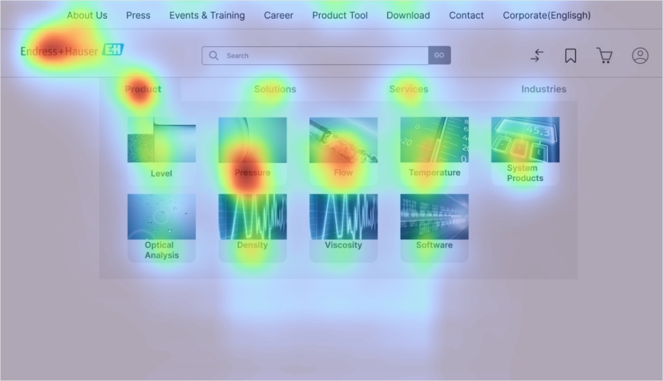
Enhanced Product Search and Filtering: Improved search functionality with relevant filters by application, industry, and technical specifications to refine product discovery.
Detailed Product Pages: Comprehensive product information including data sheets, technical specifications, compatibility details, and clear visuals to empower informed decision-making.
Product Comparison Tool: Implemented a tool allowing customers to easily compare different instrument options to identify the best fit for their needs.
Streamlined Purchase Workflow: Clear steps with progress indicators throughout the purchase process, making it easy and efficient to complete transactions.
User-Friendly Interface: Developed an intuitive interface with consistent design elements and user-friendly navigation for effortless exploration and interaction.


A high-fidelity prototype incorporating these solutions will be developed for user testing. A/B testing and further user feedback will be crucial for refining the final website design and continuously optimizing the user experience.